Where Book Lovers Belong
Roaring Stories


I'm excited to present a design solution that aligns with the needs and objectives of both our user and our client. This proposal not only addresses the Manik’s requirements as Careful Critique, but it also aligns with the strategic goals and vision of our Roaring Stories, ensuring a win-win outcome for all stakeholders.
Our Client
Our Roaring Stories offers a captivating journey into the world of books, where you'll discover personalized recommendations and insightful reviews. You can even tailor your reading experience to match your own moods and emotions, making each book a unique and immersive adventure.
Problem Statement
Our User- Meet Manik ,Our favorite critic
Hiker camper and avid reader with a keen eye for choosing his next camping companion (of course books!) He found his way to 'Roaring Stories' bookstore, a special place for uncovering hidden literary gems.However, he likes to go through the website at his convenience to do his due diligence before finalizing his next camping companion.
"While dealing with my client, Roaring Stories, I've recognized a significant challenge. Roaring Stories provides an enchanting journey into the world of books. However, my client, who is a discerning critic, relies heavily on reviews and recommendations before making a purchase. Despite their extensive book collection, Roaring Stories currently lacks a robust system for providing these essential recommendations, leaving potential customers like my client without the guidance they require to make informed choices."
Role
UX/UI Designer
Software
Figma
Figjam,Canva
Marvel, Miro, Trello
Scope
2 weeks Sprint
Business Analysis, Design Research, Sketches and Wire-framing, Low-Fi Figma Prototype,Usability Testing.User interviews Paper prototypes, Heuristic evaluation and Competitive analysis
Team
Sri Anupama
Story Boarding


Manik is currently feeling quite confused about which book to pick up next.
After a lot of thought, Manik is still feeling confused and hasn't received any book recommendations.

The staff member resolved his issue in their first conversation. He explained about the Book events, Rating and Reviews page on their website, and even guided him on how to select a book based on his moods and emotions.
objectives and pain points of clients
objectives
Improve online presence and increase online user revenue.
Provide users with a friendly and intuitive web interface.
Able to grow the user community and engage them using the online and offline initiatives.
Provide users with the best possible options.
objectives and pain points of Users
objectives
Be able to search specific category books easily with high relevance.
Enabled to perform due diligence by understanding the details of a specific book and other users feedback for better decision making.
Ability to receive the book using various delivery options.

At last, we found a bookstore called 'Roaring Stories.

Manik is very happy with his visit. Finally, he got his book and is all set for his camping travel.
Painpoints
High Competition: The online book market is highly competitive, making it challenging to stand out and gain a substantial market share.
Price Sensitivity: Customers often compare prices online, and maintaining competitive pricing while covering costs can be a challenge.
User Experience: Providing a seamless and user-friendly online shopping experience is crucial to retaining customers.
Market Trends: Staying up-to-date with changing reading habits and market trends is essential for offering relevant titles.
Painpoints
No User Reviews: The absence of user reviews and ratings is making it difficult for customers to gauge the quality of books.
Complex navigation in categories: Confusing website layouts and category options are making it challenging for users to browse and discover books.
Inadequate Customer Support: A lack of easily accessible customer support options is leaving users feeling unsupported.
Lack of Mobile Optimization: This website doesn't work well on mobile devices
Digging deeper into the problem.With the client and brief clear, I was able to begin on the ‘Discover’ phase of the UX process and conduct research surrounding book-buying habits and the current online market.
I began to investigate a variety of bookshop websites and analyze their features to see where gaps may exist in the market. I could highlight the strengths and weaknesses of existing sites and their checkout processes. I began by searching for my own local bookstore, Rye Books, and also chose to focus on Amazon, Hive Books, and Daunt Books.
A feature analysis allowed me to compare the main features, navigation, and checkout process that each competitor included on their website. I could also pick out which aspects of these websites were working and which were not.
Key Insights

Clear categories are crucial for easier navigation and a better user experience.
Users rely heavily on reviews.
Bookstores heavily focus on promoting bestsellers.
this is Very efficient checkout process in all of the larger bookstores.
Heuristic Evaluation

While the website is well-designed, Manik found that the categorization didn't quite meet his expectations.
When you click on a book from the homepage, there's no option to go back on the subsequent page.
Roaring Stories have an events page, but it seems like we can only access upcoming events, and there's no option to choose events on specific dates.
I Noticed that there isn't an option for reviewing the books.
The Help Page is not easily accessible.
The book description page isn't displaying the book stock availability.
Ideation
This user flow demonstrates how Manik can purchase books from our website. He start by browsing through categories and selecting the preferred genre. After choosing a book, if it's in stock, he can proceed to add it to cart. If the book is unavailable, there's an option to click 'Notify Me,' and if they wish to purchase it later, he can select the 'Wishlist' option."
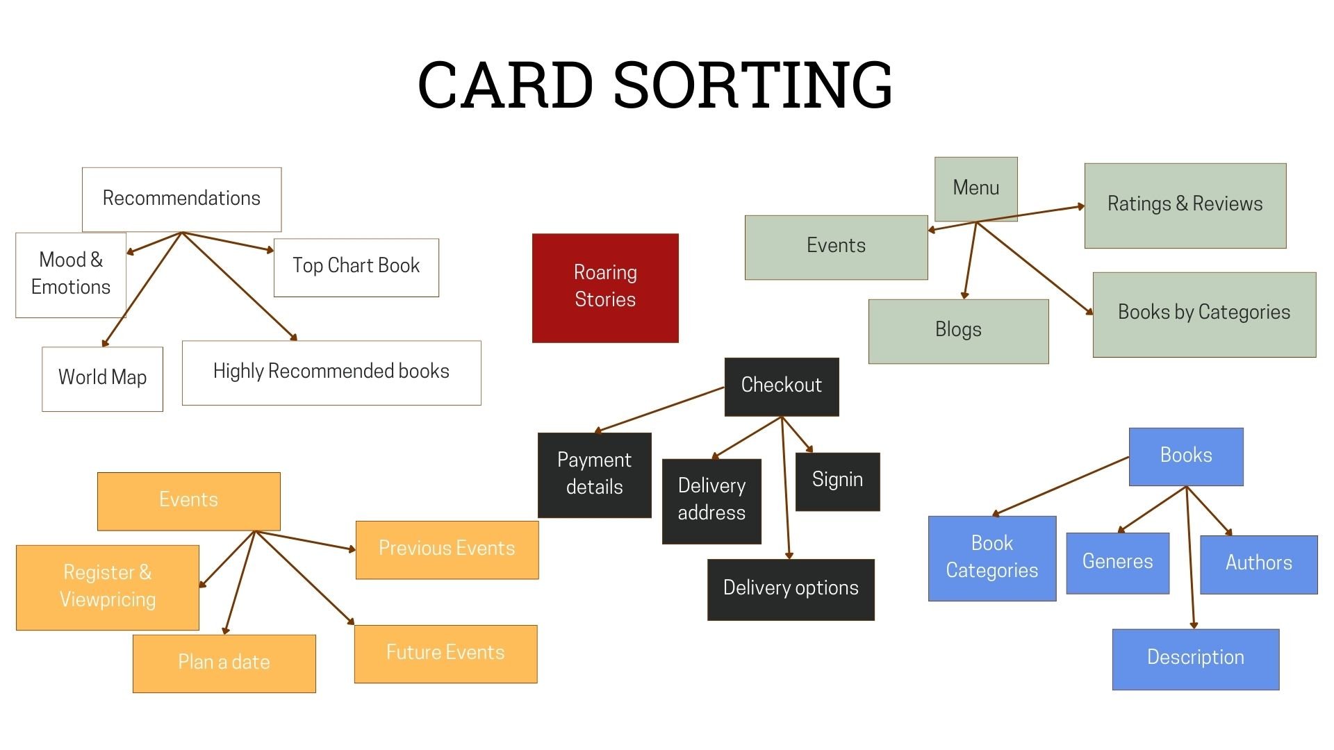
Card sorting is just like organising a messy drawer. It helps me learn how to group and label things. I gave my friends a card sorting exercise and asked them to sort it before presenting it here.
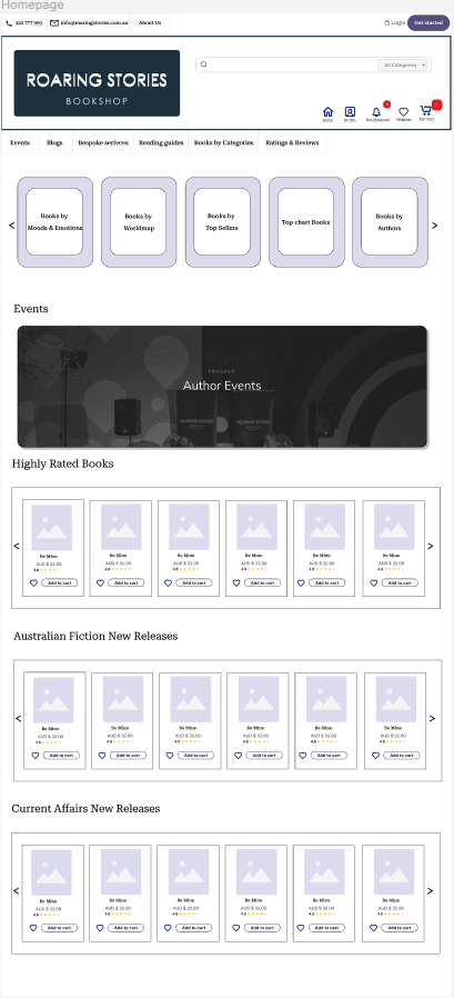
Incorporating the initial paper prototypes, I transitioned to low-fidelity digital wireframes to depict Manik's shopping journey from the landing page to checkout. These wireframes align with Manik's persona and integrate the insights gathered from previous findings. They serve as the foundation for a streamlined checkout process that follows the established user flow.

User Flows
Card Sorting


Transformative Innovation
By incorporating these modifications into the existing app, we elevated its performance and user experience.


By incorporating these carousels showcasing various book categories, we can significantly enhance the user's browsing experience. Users will feel more comfortable and find it much easier to select their desired books swiftly.
Introducing these sliders to the website will create a deeper connection between users and the platform. By enabling users to choose books based on their emotions, we're enhancing their experience and making it more personalized.


Introducing the calendar option will empower users to explore upcoming events and proactively manage their schedules. It provides them with the ability to plan ahead and stay organized.
By incorporating a dedicated rating and review page, we're ensuring that users can conveniently access and contribute their feedback without leaving the book's page. This not only facilitates a seamless reading experience but also encourages users to share their thoughts and motivate others based on recommendations. It's a win-win for both readers and our community.