Young Change agents
Entrepreneurial Learning Hub
Team
Sri Anupama
Jenny Lee
Eric Lieu
Role
UX/UI Designer
Software
Figma, Figjam,
Trello,Maze,Miro
Duration
3 weeks time sprint
Scope
Design Research, user interviews, Affinity Mapping, User Personas, UI/UX Design, Wireframing, Prototyping and Pitching
Young Change Agents is a social enterprise operating across Australia, empowering youth to tackle problems through social entrepreneurship. Their programs, integrating entrepreneurial and design thinking, are offered in 1 in 10 Australian schools for students in years . They provide funded programs in low-income public schools and fee-based programs in high-income private schools. Popular initiatives like $20 Boss, Digital Boss, and Design Challenges allow students to publish and crowdfund their ideas online.
Business Needs and Goals
Create a UI kit that follows the current brand guidelines of Young Change Agents for use across all their platforms.
Create an appealing and user-friendly workspace for students, with a strong emphasis on improved navigation and well-structured information for creating projects and submitting work.
Enhance the Buddy App's Workspace to provide teachers with an intuitive platform for efficiently managing student activities, submissions, and badge rewards
Problem
The website is tough to navigate for both teachers and students. It's not easy to find what you're looking for.
There's too much information packed together, which makes it hard for students to understand.
The names of different parts of the site are confusing.
It's not clear how to do certain things on the site, and there's not enough help or instructions.
Key Insights of Heuristics Evaluation
We made it easier to move around the website.
We organized the information so it's simpler and looks nicer.
We added clear descriptions to each page.
We included a help center for extra information and support.
We changed the names of some parts of the site to better match what they do.
Sollution
Teacher Buddy App
These are the key features we found that will help enhance the experience for the teachers:
User Orientation and Feedback
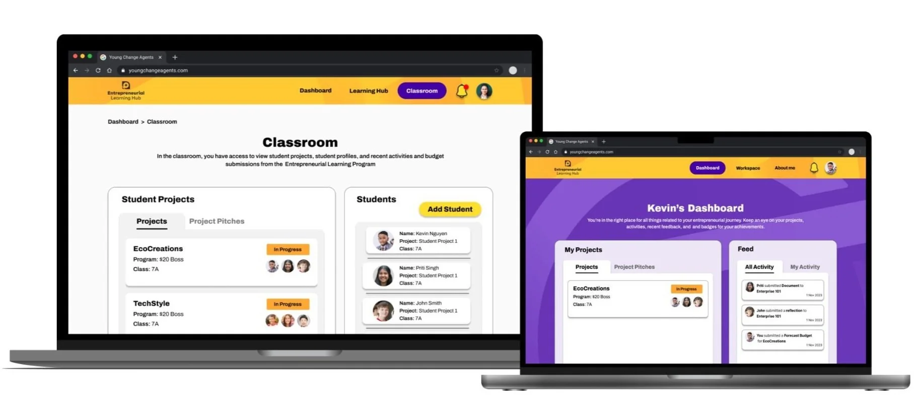
Like the student platform, there is a need to provide clear visual cues and breadcrumbs to help users understand their location within the platform. Maintain the convention of placing more visible notifications in the navigation area to inform users promptly. Include brief descriptions of the purpose of each page in the teacher portal to help educators better understand the function and relevance of each page.
Engagement and Design Improvements
Consider making slight improvements to the platform's design while maintaining a minimalist approach. This can enhance engagement for teachers without overcomplicating the user interface
Simplifying Content and Workflow
Simplify the flow on the platform to enable teachers to view students' works more promptly. This involves streamlining the process and reducing unnecessary steps. Offer features that allow teachers to review submissions they have marked, undo actions, and edit comments. This simplifies the workflow and allows for quick corrections and adjustments.
Student Workspace
These are the key features we found that will help enhance the experience for the students:
User Orientation and Feedback
Progress bars and breadcrumbs assist users in understanding their location on the platform and can reduce navigation confusion By making feedback more visible, users can easily recognize their achievements and feel reassured that tasks have been successfully completed.
Streamlining Content
Simplifying and reducing complex content to prevent students from feeling overwhelmed.
Editing and User Control
Enable students to edit, update, and save with minimal input, giving them the flexibility to complete tasks at their convenience.
Introducing Gamification and Aesthetic Appeal
Introducing Gamification and Aesthetic Appeal Introducing visually appealing gamification elements on the platform encourages students to actively participate and complete tasks. This playful approach will boost engagement and motivation, enhancing the overall experience for the students.
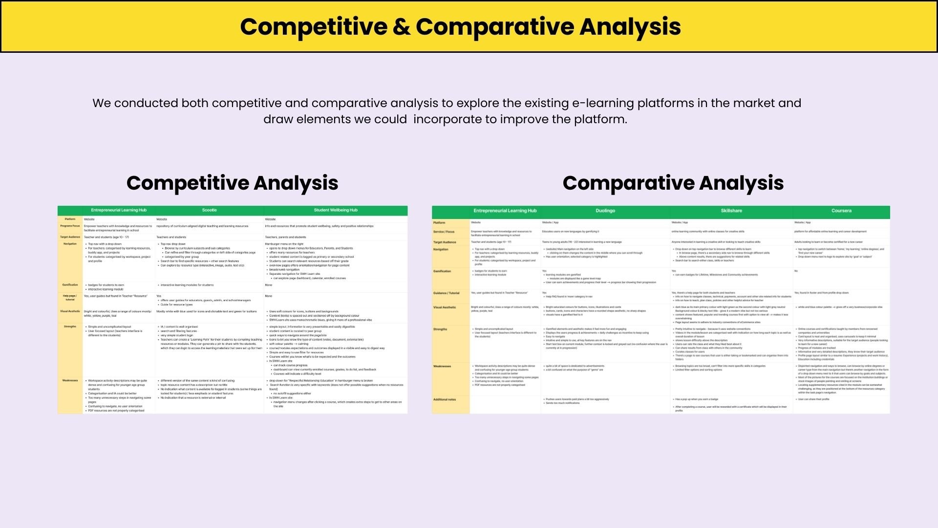
Competitive and Comparative Analysis
Key Takeaways From our Competitors
User Dashboard
Student Wellness Hub provides users with a dashboard displaying recently accessed courses, grades, to-do lists, and feedback. This feature offers users insights into their learning progress and upcoming tasks.
User-Friendly Layout
Both platforms adopt user-friendly layouts that are spacious, dedicated to specific content categories, and light on text. This approach aims to make the platforms accessible, especially to younger users.
Clear Guidance
Both platforms focus on providing clear and concise instructions to users. For instance, SWH gives clear instructions on using resources within module courses.
Key Takeaways From our Comparators
Gamification and Engagement
Duolingo gamifies the learning experience, while Skillshare and Coursera reward users with achievements, milestones, and certificates, enhancing engagement and motivation.
Progress Tracking and Rewards
All three platforms offer users the ability to track their progress, achieve milestones, and earn rewards, including badges and certificates, reinforcing user accomplishment and recognition.
Engaging Visual Resources
Duolingo incorporates illustrations, animations, and minimal text to enhance accessibility and engagement, while Skillshare provides relevant video and reading resources alongside module activities.
Usability Testing on the Current Site
We conducted usability testing to uncover user pain points and needs within the Entrepreneurial Learning Hub, testing both students and teachers who had not previously participated in the program.
These tasks were assigned to students during our usability testing on the current website:
Create a Team Project
Create a $20 Boss team
On Workspace, upload a document
Write a reflection and submit it
On workspace, have them do a budget
On workspace, create ‘Team Project Page’
Check their badges in “About Me.”
Key Insights from Students
Desire for Appealing Visuals for Engagement
Students have expressed a desire for increased visual content to enhance engagement and make it easier to understand.
Clarity In Names
Users have expressed confusion regarding the wording for the "Create Project" button, as it gives the impression of initiating a new program.
Improved Content Organization
There is a requirement to prioritize and reorganize the existing content to enhance accessibility for students.
Need for Guidance and Information for Students
There is a significant demand for guidance and additional information to empower students to independently understand their tasks and requirements.
These tasks were assigned to teachers during our usability testing on the current website:
Go through the “Student” page - Ask them what they expect or want to see in the pages
Go to “My Teams”, Create a Team for $20 Boss
View the Budget of the team - what do they expect to see
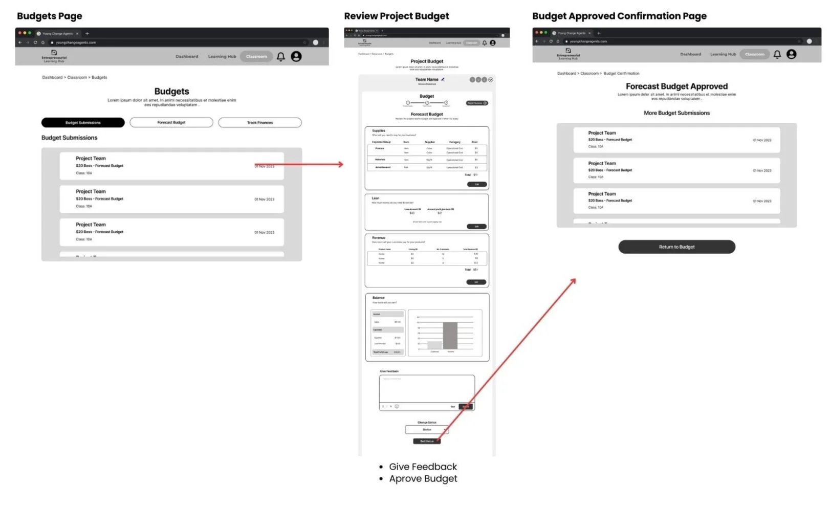
Change budget status to Approved
Check any of the submissions on the “Submission page”
Add a comment to a student reflection
Give all team members a badge
Mark submission as complete
Key Insights from Teachers
Streamlined way Access to Information
There's a need for a more straightforward way to access content, allowing teachers to view things quickly and efficiently.
Tracking Students Work
The desire to easily track students work provides teachers with a way to view student submissions and monitor their progress toward milestones.
Clarity in Labels
Teachers emphasize the need for improved naming and clarity regarding the 'Buddy App,' which should be directly associated with monitoring student projects, budgets, and submissions.
Limitation in Time for Teachers
Given the busy schedules teachers juggle, there needs to be a solution for the Buddy App to be more intuitive and less time-consuming.
Low fidelity Prototypes
Ideal User Journey for teachers -
Review Student Submission Flow
Approve Forecast Budget flow
Ideal User Journey for students
Creating a new project flow
Completing Workspace Activity flow
Submitting project budget forecast flow
Usability testing
To ensure our design was on the right track, we conducted tests with the same students and teachers using our low-fidelity prototype. This allowed us to gather valuable feedback, identify the successful aspects, and pinpoint areas that needed further refinement. This process was crucial in guiding us towards the development of a more polished, high-fidelity version.
Key Insights for Teachers platform
Additional Context in Submissions
Teachers emphasised the need for an efficient method to review learning objectives while grading student submissions, providing quick access to the learning activities in which the students participated.
Additional Content in Dashboard
The teacher recommends enhancing the dashboard's content and utility by including additional elements that provide quick access to student projects information.
Confirmation Page Clarity
There was still a need to enhance the confirmation page to ensure clarity when teachers finish marking project submissions and approved budgets.
Need to Consistent Label
Insights: Teachers have emphasised the need for consistent and standardised naming across the platform to avoid confusion.
Key Insights for Students platform
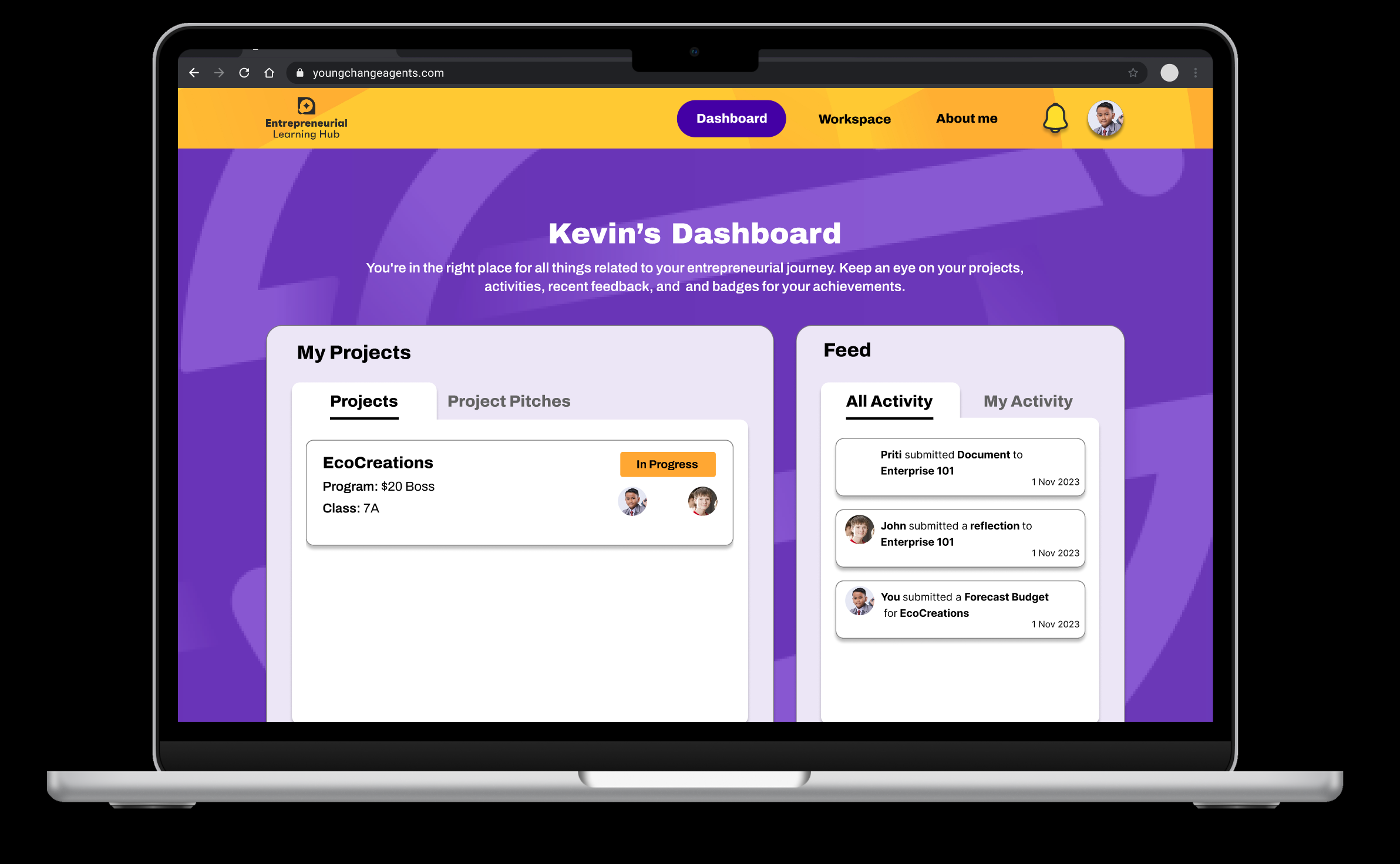
Dashboard Personalisation
Students have suggested adding a personal touch to the dashboard by displaying their names.
Consistent Label
Students have stressed the importance of having consistent and standardised naming throughout the platform to prevent confusion.
Confirmation Message Clarity
Students still stressed the need for clearer confirmation messages in the Workspace when they finish the task so they can feel reassured that they are on the right track.
Prototype
"I'd like to share some key takeaways from this project with you. These points highlight the most important lessons we've learned and the significant insights we've gained throughout the process. Understanding these takeaways will give you a clear picture of what we achieved, what challenges we faced, and how we overcame them.
Prioritizing User Testing Early on: We learned how crucial it is to focus on user testing from the start. By getting feedback on our early, simple prototypes, we were able to fix problems early. This made it easier to move on to more detailed designs. This not only made our solution better for users but also saved us time by fixing big issues right away.
Designing for Our Specific Audience: It was really important to test our designs with the people who would actually use them. Getting insights from teachers helped us meet the needs of the classroom. Testing with students of various ages made sure our design was easy for everyone to use, no matter their age.
Keeping Open Lines of Communication with the Client: Talking openly and regularly with our client was a key part of our success. We kept them updated on our progress and decisions, which made sure we were always on the same page. This helped us include their feedback smoothly and kept our work in line with their vision, making for a great team effort throughout the project.
